Authenticity
Truthfulness/reliability, of origins, attributions, commitment, sincerity, devotion and intentions.
Appropriation
Acto of taking possession of or assigning purposes to ideas and concepts.
Avant Garde
Art and design form that pushes the boundaries of what is accepted as the norm or status quo, primarily in the cultural frame. A hall - mark of modernism that refer to personal or works that are experimental or innovative, particularly with respect to art, culture and politics.
Binary Opposites
The oppositions through which reality has traditionally been represente eg. male/female, nature/culture, min/body
Bricolage
A construction made by whatever materials at hand. Something created from a variety of available things.
Broadcast media
The distribution of audio/video signals which transmit programs to an audience. The audience may be the general public or a relatively large sub audience, such as children or young adults.
Capitalism
Economic system in which the means of production are privately owned and opened for profit. Country's trade and industry are controlled by private owners for profit, rather than by the state.
Cinema Verite/ 'truthful cinema'
Style of documentary film making, combing naturalistic techniques with stylised cinematic devices, ie. editing, camera work, staged set ups, use of camera works to provoke subjects.
Connotative Meaning
All the social, cultural and historical meanings that are added to signs literal meaning. Relies on the cultural and historical context of the image and its viewers lived, felt knowledge of those circumstances. Connotation thus brings to an object or image in the wider realm of ideology, cultural meaning and value systems of a society.
Wednesday, 15 June 2011
Friday, 10 June 2011
Week 13 - Worn Issues : Insight Into Symbol Design
Issue of Concern : Attitudes towards Abortion and Fetal Birth Right
Review of Process and Justification of Symbol
My T-shirt design, presented below, raises the issue of clinical abortion and surgery's lack of appreciation for the value of life and creation. With steady technological advancements in surgery and health initiatives, along with changes in cultural and religious values regarding birth right and creation, clynical abortion, for the past century, has received its fair share of public criticism's and support in regards to whether life comes before choice, or choice comes before life, with two opposing groups coming into conflict on the issue. Pro-Life representatives argue that indeed life comes before choice, and thus oppose abortion on moral and perhaps religious grounds, arguing that birth is a natural and organic process that should not be prevented, or altered by human hands, particularly on the basis of a young mother who's pregnancy is incidental and in fact has no emotional attachment to the child she bares. The Pro-Life group in general have no remorse for mothers who look to abortion purely as a way of forgetting their mistakes and to be rid of an extra burden, arguing that in today's society there are plenty of health care initiatives aimed at supporting mothers and their new born child. Furthermore, pro-life enthusiasts argue that although the fetus has no physical control over his or her own life, that fetus should still have a fair chance at life and should be regarded as precious life not an expendable item. Religious Pro-life individuals have particular concerns towards the accessibility and, what is more controversial, doctor's encouragement of abortions, as they believe that creation should be in the hands of God and not invaded by human choice.
In opposition to Pro-life campaigners, Pro-Choice individuals, supported by many medical figures, and scientific atheists, argue that abortion is a legal choice and reasonable alternative to pregnancy for the young mother, based on the mother's personal health and future, and that the mother, as the creator, has the dominant say over the fetus.
The official and overall aim of my symbol was not generate one of the above views but rather to give light to a neutral perspective on the issue, to raise the horror of the issue, but leave the personal views to the perspectives of viewers.
My approach thus, was to give a symbolised insight into the overall abortion process, hopefully without generating an overly crude or gruesome image, and to leave the issue open for the public.

In regards to student feedback, issue raised by the symbol was quite clear, and strongly communicated, however the execution of the symbol's presentation could have been better, (the burnt background behind the symbol was not intended), and I believe that those faults pulled away from the overall strength of symbol and its effectiveness to communicate the issue. Furthermore, my decision to give the symbol and related issue a neutral stance resulted unfortunately in the message of the t-shirt leaning towards a pro-choice view, which was something I hoped to avoid as it does not share with my personal distaste of abortion and man's control over helpless life. This issue was of the symbol's overall message was raised mainly by Khim, who hinted that the symbol placing abortion in an affirmative light. Thus, to improve on the symbol perhaps I should have taken a strict negative stance, that serves as propaganda to enforce the negative outcomes of abortion as an execution of life and thus draw people towards considering the value of birth and hence away from the surgical alternative.
Sunday, 5 June 2011
Week 10 - Designing Design
Review of 'Landscapes of the Unknown :Kenya Hara's Design', Interviewer - Blaine Brownell
http://ambidextrousmag.org/issues/10/articles/lead_i10p34_37.pdf
Kenya Quotes: (responses to questions)
'How is your approach to design unique among designers?'
"I do no think in a conventional way. I am not creating forms that inspire a 'wow'. I am sensitive to do this because it does not attract."
"We think of things that are nothing in daily life and discover a design that surprises - that becomes progress."
"My role in design is to awaken the power of design. That is to say that amidst the usual daily life, I want to make others think: can something look like this, or can a table look like this?"
"We don't guide people on what to buy - it's crucial to make people realise and understand anew, something about daily life that they thought they already understood.
"In daily life, a cup is a cup, a plate is a plate without a doubt. Without any gradation, which one is the plate?… Rather than making an amazing form for a cup, it's more effective not to understand the difference between a cup and plate."
'Describe yourself as a designer'
"My work is the identity people have with a product, what makes them gather at a place for a product. The product is not a physical object, but a language."
"I am creating information architecture, design that is directed towards what enters the mind from outside through the senses - sight, smell, sound, touch, and taste. These are the ingredients…. This builds the architecture of the mind."
'How do you feel about new materials being developed'?
"Because of human senses, various things are capable of being felt. There is a whole new world we still haven't felt. If we looked at a simple map of senses, there are about two hundred sensations on the North America continent alone. But I am trying to find a new way to discover them".
"When we design something, it's always about the outside - the colour, shape and form, texture. The exterior is important, but how you feel it once, in a previous experience, actually intensifies your impression. That is to say, until now I haven't felt anything like this - an experience not had until now."
"Material on its own is not interesting. The way of feeling it has to be well planned."
'Your work is often simple, but it is never simplistic.'
"Kanso', means simple in Japanese. It is an inoperative meaning, different from the English word 'simple'. MUJI products are simple, but they have quality, or there is quality in something simple… Specifically, if something is simple, it can inspire many kinds of imaginations - its capacity is large"
"At MUJI, we only make for them one table. But making the same table for both people is extremely difficult. Therefore, simple means emptiness. Through this emptiness, and ideal image can emerge."
"No Image already exists, but you can insert your own image into that object, and that is okay.
'Is this the same as the Japanese idea of 'ma' - the physical space between things, like emptiness?'
"It's not just 'ma', 'ma' is first emptiness. However with Muji it's simple but the MUJI logo is also famous, it carries many images. For some people, it represents ecology, for some simplicity, for some affordability, for some no design, for some sophistication. So there are a lot of meanings but they never imply the meaning of empty. For that reason it becomes an image and an icon right away."
"Whether it is conscious, or sub conscious, it is straight forwardly simple. In that case, straight forward simplicity and simple quality differ.
'What future do you see for your work?'
"Design that humans can understand. Math and Philosophy text book designs are stiff and if I don't do them it would be a shame. If there was a well designed maths textbook, it would be amazing."
Word for word review of Hara's 'Designing Design', reviewed by Blaine Brownel
Extension on 'Landscapes of the Unknown' Article:
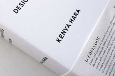
Interior and Exterior Package Design for Kenya Hara's 'Designing Design'


http://ambidextrousmag.org/issues/10/articles/lead_i10p34_37.pdf
Kenya Quotes: (responses to questions)
'How is your approach to design unique among designers?'
"I do no think in a conventional way. I am not creating forms that inspire a 'wow'. I am sensitive to do this because it does not attract."
"We think of things that are nothing in daily life and discover a design that surprises - that becomes progress."
"My role in design is to awaken the power of design. That is to say that amidst the usual daily life, I want to make others think: can something look like this, or can a table look like this?"
"We don't guide people on what to buy - it's crucial to make people realise and understand anew, something about daily life that they thought they already understood.
"In daily life, a cup is a cup, a plate is a plate without a doubt. Without any gradation, which one is the plate?… Rather than making an amazing form for a cup, it's more effective not to understand the difference between a cup and plate."
'Describe yourself as a designer'
"My work is the identity people have with a product, what makes them gather at a place for a product. The product is not a physical object, but a language."
"I am creating information architecture, design that is directed towards what enters the mind from outside through the senses - sight, smell, sound, touch, and taste. These are the ingredients…. This builds the architecture of the mind."
'How do you feel about new materials being developed'?
"Because of human senses, various things are capable of being felt. There is a whole new world we still haven't felt. If we looked at a simple map of senses, there are about two hundred sensations on the North America continent alone. But I am trying to find a new way to discover them".
"When we design something, it's always about the outside - the colour, shape and form, texture. The exterior is important, but how you feel it once, in a previous experience, actually intensifies your impression. That is to say, until now I haven't felt anything like this - an experience not had until now."
"Material on its own is not interesting. The way of feeling it has to be well planned."
'Your work is often simple, but it is never simplistic.'
"Kanso', means simple in Japanese. It is an inoperative meaning, different from the English word 'simple'. MUJI products are simple, but they have quality, or there is quality in something simple… Specifically, if something is simple, it can inspire many kinds of imaginations - its capacity is large"
"At MUJI, we only make for them one table. But making the same table for both people is extremely difficult. Therefore, simple means emptiness. Through this emptiness, and ideal image can emerge."
"No Image already exists, but you can insert your own image into that object, and that is okay.
'Is this the same as the Japanese idea of 'ma' - the physical space between things, like emptiness?'
"It's not just 'ma', 'ma' is first emptiness. However with Muji it's simple but the MUJI logo is also famous, it carries many images. For some people, it represents ecology, for some simplicity, for some affordability, for some no design, for some sophistication. So there are a lot of meanings but they never imply the meaning of empty. For that reason it becomes an image and an icon right away."
"Whether it is conscious, or sub conscious, it is straight forwardly simple. In that case, straight forward simplicity and simple quality differ.
'What future do you see for your work?'
"Design that humans can understand. Math and Philosophy text book designs are stiff and if I don't do them it would be a shame. If there was a well designed maths textbook, it would be amazing."
Word for word review of Hara's 'Designing Design', reviewed by Blaine Brownel
Extension on 'Landscapes of the Unknown' Article:
Part treatise, part biography, and part monograph, Kenya Hara’s book, Designing Design, operates as a kind of quiet manifesto for design in the new millennium. While such combinations of design analysis and synthesis usu- ally seem forced, the essays and monograph elements in Designing Design hold together uncannily well, much like the diverse and carefully-crafted dishes in a multi-course kaiseki meal.
One of the most compelling concepts Hara promotes is the process of making the ordinary unknown. In the West, we often describe design’s role in making the invis- ible visible, or shedding light on the unknown. Such use of design in charting unfamiliar territory relates to the notion of scientific progress and technological advancement, but it neglects information about simple things right in front of us. Hara bemoans our culture of knowing facts without truly understanding their deeper implications.
His antidote is a process called “exformation” that seeks to make the world unknown, by locating the fuzzy edges and inconsistencies within the knowledge base we think is already complete. exformation is a tool that sharpens our awareness of just how little we know about the world, and in turn provides refreshing new insights for design. Hara is more interested in questions than answers, and he believes, as he writes in the book, that creativity is “to discover a question that has never been asked.” The exformation process is demonstrated in his Shimanto river studies that integrate roadways with the last of Japan’s pristine waterways, or his sublime MUJI “House” posters that depict vernacular dwellings lost within harsh and over- powering natural environments.
For Hara, design is conceived as a platform to gener- ate dialogue rather than one-way exchange. design should
be an empty vessel with space set aside for the user’s own thoughts and curiosities, a distinctly Japanese ap- proach that we also see in the minimalist structures of the Japanese architecture firm SAnAA and subtly provocative product designs of the Japanese design firm nendo. The provision of such space gets attention precisely because it is so devoid of meaning. Particularly within the sea of visual noise that is the Japanese city, this strategy provides welcome relief to the eyes, and allows the user to enter the conversation as if asked, “What do you want me to be?” In this sense, emptiness is not solitude but opportunity. Like the dramatic pause in no drama, this space in design serves to build anticipation for what is to come rather than provide an easy answer.
considering Hara’s philosophy that design is a vehicle through which to ask intelligent questions rather than provide clever answers, the book appropriately leaves the reader with many questions. Has the pace of life and its increasing number of distractions, not to mention the over- abundance of consumer products and ubiquitous commer- cialism, reached a saturation point for most of us? can de- sign respond successfully to the new global eco-anxieties, political concerns, and economic woes with its traditional attention-getting, solution-providing strategies? Aren’t we all now a little too smart to believe that someone else has all the answers?
Maybe facing our ignorance about the world is the only way to confront new challenges. Perhaps design has to un- learn itself in order to provide something new. Interior and Exterior Package Design for Kenya Hara's 'Designing Design'


Examples of Product Design by Kenya Hara


Saturday, 4 June 2011
Week 11-Creative Thinking
The Challenge for this weeks class was to explore creative thinking and to come to a personal definition of what it means to think creatively. I, here, have provided my own definition of creative thinking.


To think creatively is to break through the boundaries of conformity, to depart from those black and white conservatives in their crisp, grey suits, and to set sail on a voyage, of mystery, absurdity, and imagination. To venture, into waters not yet explored, those places that we have not yet travelled, and hence, to step out of our comfort zones, out of our cushy computer chairs where imagination sits still and is dead, and to breath in the creativity of the world, the vibrant cultures, the unique characters, the contrast of the urban sounds with the still, eery silences, the awakened day, with the slumbered night. For it is only by stepping out of our familiarity and into a new world that we can breathe in imagination and broaden the corners of our mind. To the creative person, the world is both full of colour, and in black and white, life is both simple and quite complicated, we can never achieve perfection in our work, but we most certainly experience disasters, the world is round, and the world is flat, and if we decide to go to the utmost ridiculous, it may as well as be triangle. The possibilities are endless and there is never only one way at looking at something, and depending on our mood, reality distorts itself and changes, even when we mean it not to. For the creative mind there is nothing absurd about melting clocks, or leaning structures, or men hacking off their limbs in front of a disturbed and shocked crowd, for it is the air that that person breathes, and his or her way of relating to the world, and such a strange idea is a brilliant one… is it not?
Designs that I find inspirational for creative thinking:


Subscribe to:
Posts (Atom)